If you follow the market even loosely, you will keep hearing one phrase: the 200-day moving average. In 2026 it has been hard to avoid, because the Nifty 50 fell below its 200-day moving average on 27 February 2026 and was still under it in late September, a run that passed 100 trading days on 28 July, its longest in a decade. So what is this line the whole market watches, and why does being on the wrong side of it matter so much?
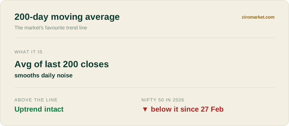
At its simplest, a moving average answers a question a single day's price cannot: which way is this actually heading? One green or red session tells you almost nothing. An average of the last 200 sessions tells you the trend.
How is it built?
The calculation is exactly what it sounds like. You take the closing prices of the last 200 trading days, average them, and plot that single point, then repeat every day so the line "moves" forward. Each new day drops the oldest price and adds the latest, which is why the average shifts gradually rather than jumping around like the daily price does.
That slowness is the point. Because it blends 200 days, roughly ten months of trading, the 200-DMA barely flinches at a single sharp session, so it filters out noise and leaves the underlying direction. A rising 200-DMA means the long-term trend is up; a falling one means it is down, and the Nifty's has been drifting lower since the spring, from about 24,790 in late July to about 24,516 by mid-September.
Why does price versus the line matter?
Traders care less about the number itself and more about where price sits relative to it. When an index trades above its 200-DMA, the long-term trend is treated as healthy; when it slips below, the trend is treated as broken, which is why the line often acts as a floor in good times and a ceiling in bad ones.
The 2026 run is a textbook example of the ceiling at work. The Nifty rallied about 10.8% from its 2 April low of 22,182.55 to roughly 24,580 in August, close to the line, then turned lower again as crude crossed $100 and the Federal Reserve hiked. Rallies that stall just under a falling 200-DMA are exactly what a downtrend looks like on a chart, and our Nifty 2026 bear phase analysis covers what drove each leg.
The 50-day, the 200-day, and the crosses
The 200-DMA rarely travels alone. Its faster cousin, the 50-day moving average, reacts more quickly to recent prices and is watched for medium-term shifts. How the two interact has its own famous names.
A golden cross is seen as momentum turning up and a death cross as it turning down, and both make headlines when they hit a big index like the Nifty or a heavyweight like Reliance or HDFC Bank. They are signals to watch, not commands to act.
Where does it fall short?
The catch is baked into the maths. Because the 200-DMA is built entirely from past prices, it is a lagging indicator: it confirms a trend after it has formed rather than predicting one. In a choppy, sideways market it can whipsaw, flashing a bullish reclaim one week and a bearish break the next, which is why seasoned traders never treat it as a lone trigger.
It also says nothing about value. The Nifty's price-to-earnings ratio fell to about 19.5 in September 2026, below its five-year median of about 22, which a long-term investor might read as cheaper, at the same time as the trend line reads as bearish. Our PE ratio explainer covers that side.
For a long-term SIP investor, the practical use is modest: the line tells you what the trend is, not what to do about it. For a trader, the signal worth waiting for is not a single close above 24,500 or so but several sessions holding there, because a quick slip back below would turn a bullish headline into another false start.